One of my favourite things to do is walk through the forests at Long Beach. Here a couple of favourite areas.
West Coast Trees
These trees are either near Tofino or Cathedral Grove near Port Alberni. Click on thumbnail to see larger image.
Tofino, BC
Recently I was on a Long Beach trip with my good friend Shirley who lives in my hometown of Calgary. We have known each other for 40 years. Shirley and I stayed at the Middle Beach Lodge about 2 miles from Tofino. Below are images of the lodge and surrounding area. That is a picture of Shirley just behind the globe.
Shirley and I enjoyed a whale watching cruise with "Marine Adventures". Wow, what a lot of fun. The covered boat holds 12 people but this day there were 9 of us on board We saw lots of gray whales fairly close to the boat, first you see a puff of steam coming from the blow hole and then a slow movement of their back just out of the water and slipping back into the water. Those on board who hadn't seen this before screamed in glee each time! At times we sped along really fast and slammed down and up and down and up, into and against the waves, I really enjoyed it and found it thrilling. On our way back we stopped by a small island with an outcropping of rocks where sea lions, puffins and many other sea life and birds inhabit.
I fell in love with the tangled networks of seaweeds.
I was in total awe by the tidal pools and all the sea life. I am so inspired that my next series will be based on the tangled networks above and the sea life below. I have already started my initial drawings. Stay tuned for sneak peeks along the way.
Tanta DeStaffany Pennington
Infinite Reality -- In Search of Memory
Tanta is currently the Artist in Residence, at the Oswego Hotel. 500 Oswego Street, Victoria, BC Canada. In Search of Memory will be exhibited throughout 2013.
The five paintings in the show "Infinite Reality -- In Search of Memory" are heavily inspired by memory. Using a combination of painted ethereal cloud formations, delicate lace drawings and hard-edge industrial forms, Tanta creates a visual vocabulary of family memories, real and imagined. In this series, the threads of past recollections are woven into a future of possibilities.
Tanta Pennington is a contemporoary artist based in Victoria BC.
Past exhibitions include the Art Gallery of Greater Victoria, Victoria Internatinal Airport, The Victoria Conference Centre and various galleries throughout Victoria, BC. Tanta participated in the international 2011 Florence Biennale and her work is in collections in Western Canada, California, Hawaii, and Italy.
David Blackwood Prints of Newfoundland
Art Gallery of Greater Victoria
Date: May 3, 2013 - September 8, 2013
Curated by Katharine Lochnan and organized by the Art Gallery of Ontario
David Blackwood is one of Canada’s leading printmakers and most popular artists. He has been telling stories about Newfoundland in the form of epic visual narratives for over 30 years.
This exhibition showcases many of his iconic works, revealing the richness of Blackwood’s imagination and his working methods. It also includes historical artifacts and archival material from the artist's own collection, creating an experience thatdraws on childhood memories, dreams, superstitions, legends, the oral tradition, and the political realities of the Wesleyville community on Bonavista Bay where Blackwood was born and raised.
Black Ice situates Blackwood's distinctive visual narratives within the context of the history of Newfoundland and Labrador, drawing attention to his examination of the grand theme of survival in an inhospitable landscape. In his consideration of a centuries-old way of life that is now quickly disappearing, he incorporates issues of class, gender, immigration, settlement, intergenerational struggle, and religious & political tensions that introduce his viewers to the specifics of Newfoundland's situation while offering points of entry that are universal in their appeal.
Although we live in a very different time and geography than Blackwood’s Newfoundland, there is, perhaps, something in our island experience and maritime history that makes his work resonate very deeply here.
Impulse - Diploma Graduation Exhibition 2013
Vancouver Island School of Art (VISA) presents their 2013 Graduation Exhibition
Slide Room Gallery
2549 Quadra Street, Victoria, BC
Monday to Friday 9:00-5:00
Sandra Cinto
During our spring break to Seattle we were fortunate to view this beautiful site-specific installation by Sandra Cinto. Cinto worked with a team of volunteers to draw thousands of silver paint lines on the wall. Watch this video to see a great collaboration between this visiting artist and local Seattleites.
Detail of Encontro das Águas
Photo Credit - Jill Ehlert
Encontro das Águas [Encounter of Waters}
Seattle Art Museum's Olympic Sculpture Park April 14, 2012 - April 14, 2013.
Sandra Cinto a São Paulo--based artist created Encontro das Águas as
a site-specific installation for the Olympic Sculpture Park's PACCAR Pavilion in Seattle Washington.
Cinto's Encontro das Águas is a large but intricate wall drawing that conveys a view of an expansive waterscape.
"Cinto works directly on the wall and transforms a single line, repeated at different angles and lengths, into a titanic image of water that expresses both renewal and risk. As a counterpoint to this unbridled seascape, Cinto incorporates stories about individuals who were rescued at sea, to show the endurance of the human spirit in difficult circumstances."
–Marisa C. Sánchez, Associate Curator, Modern & Contemporary Art
Seattle trip
In April, my husband Paul and I went to Seattle for 5 days. We started our trip off in Seattle by having a delicious lunch at Ivar's Salmon House on Lake Union. Afterwards I saw the recent exhibits at the Henry Art Gallery - one of which was Sean Scully.
We were staying in a hotel on Lake Union, later that evening we had a crab dinner at Duke's Chowder House Lake Union
The picture in the slide show with the yachts, palm trees and Space Needle in the distance was taken from our window at Duke's.
The next day we went to the new Chihuly Garden and Glass venue. This is located at Seattle Centre right below the Space Needle.
First we had lunch in the Collections Cafe that is housed within the exhibition hall. In the cafe are many of Chihuly's personal collections from carnival chalkware, vintage accordions, radios, cameras, and shaving brushes to tin toys. As well there is a backlit drawing wall with 36 of Chihuly's drawings done on plexiglass. My favourite collection was dozens of accordions hanging from the ceiling. It was a wonderful room, I loved the atmosphere, look and feel of the space. The service was great and the food delicious. I would go there again.
We enjoyed the glass exhibits with our favourite room being the Northwest room presenting Chihuly's earliest experiments with glass. This room showcases his collections of Northwest Coast Indian baskets and American Indian trade blankets.
Drawing is my favourite medium, so I enjoyed the drawing walls. Chihuly says that "drawing really helps me to think about things. I'm able to draw and work with a lot of colour and that inspires me" Chihuly draws with unconventional materials--liquid pigment squeezed from plastic bottles can suggest the ways that different colours of molten glass merge and mingle.
Other highlights of our time in Seattle included the Sandra Cinto Exhibition at the Olympic Sculpture Park PACCAR Pavilion and the Rembrandt, Van Dyck and Gainsborough Exhibition at the Seattle Art Museum (SAM)
Driving home to Canada we took a detour to see the Skagit tulip festival which was a wonderful sight to see. So many fields of colour, orange, red, pink, purple, yellow. Amazing. A must see for our annual spring trip to Seattle.
Artist Profile - Val Britton
Val Britton was born in Livingston, NJ. She earned a BFA from the Rhode Island School of Design, Providence, RI 1999, and a MFA, from the California College of the Arts, San Francisco/Oakland, CA, 2006. She lives and works in San Francisco, CA
Val Britton creates intricate collage works that vary in size from pieces as large as 72 x 96 inches to small intimate pieces 8.5 x 8.5 inches. While Val works with a variety of papers by staining, painting, tearing, cutting, composing...she looks to the language of mapping and drawing to inform her process.
Large continent and island like shapes are cut or torn from pieces of this prepared paper, these shapes are in contrast to other areas of meticulous and elaborate line work that look similar to the intricacy of a spider’s web. Britton's lines are painstakingly cut out and composed. These matchstick and thread like lines criss-cross over richly coloured areas. Deep magenta, fuchsia, gray and turquoise are shot through with tones of rich earthy browns next to velvet black land masses. Other colour areas puddle together in pools like gasoline sits on top of water leaving rings of shimmering iridescent blues and pinks. Other areas of paper have slits cut in and delicately peeled back adding texture and direction to her collage pieces.
The vernacular of cartography informs the look and feel of Britton's complex collages. She has created a rich vocabulary that translates well into her work; a network of contour lines depict topographical and geographical information whereas cut and punctured areas symbolize roads, routes and directional co-ordinates. Britton employs drawing elements such as line, shape, texture, colour, value, size and scale to order, direct and structure her unique artworks.
Britton takes the vernacular of both mapping and drawing combining them with traditional painting materials such as gouache, ink, tempera and latex paint. She begins her work by sketching from old photographs, projecting maps, sections of her drawings and ink paintings onto her support material.
Britton’s inspiration comes from USA transcontinental trucking routes that her father traversed during his career. Her father passed away when she was a teenager and in trying to come to terms with his death she says she is mapping out the psychological and emotional spaces inside of her. Mapping acts as a metaphor in Britton's collages, she is searching and exploring a new terrain in order to piece together fragments of her past life. Written by Jill Ehlert
Great links to see Val's work:
Val Britton Website - great images - you can zoom in and see the intricate detail of her work.
Val Britton interview at "In the Make" Studio visits with west coast artists - this is a fantastic interview with Val with great pictures of her studio and process.
Julie Mehretu
Julie Mehretu isan American artist who was born in 1970 in Addis Ababa, Ethiopia. She studied at University Cheikh Anta Diop, Dakar (1990–91), earned a BA from Kalamazoo College, Michigan (1992), and an MFA from Rhode Island School of Design, Providence (1997). She lives and works in New York City, NY and Berlin, Germany.
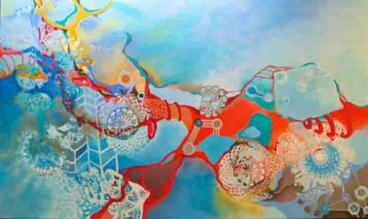
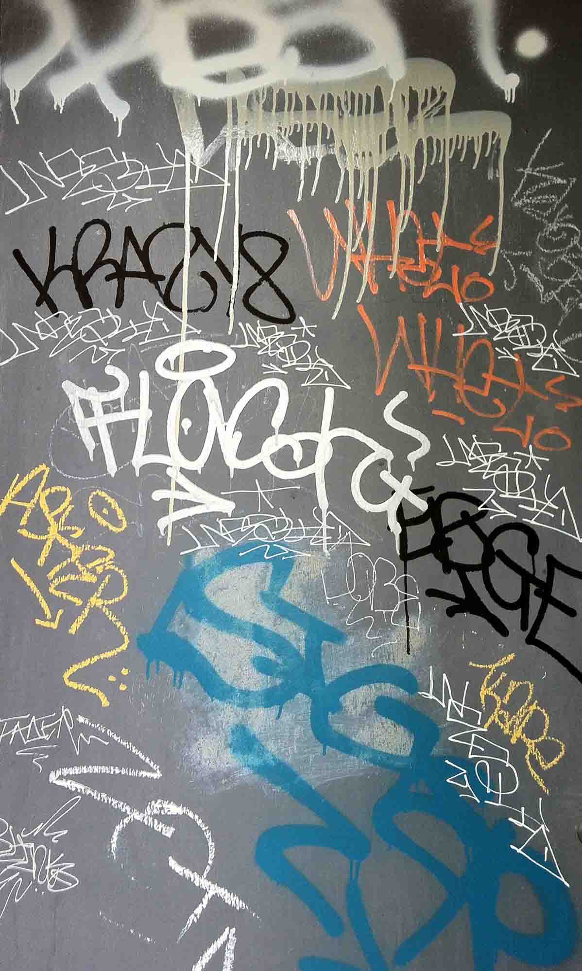
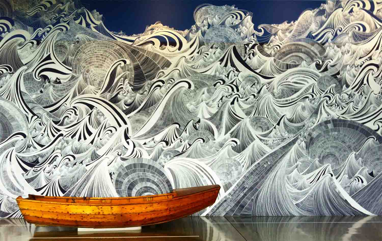
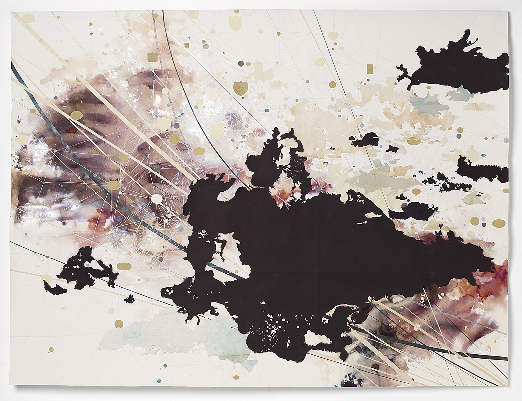
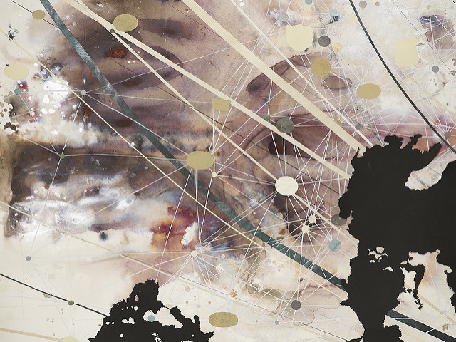
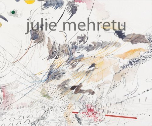
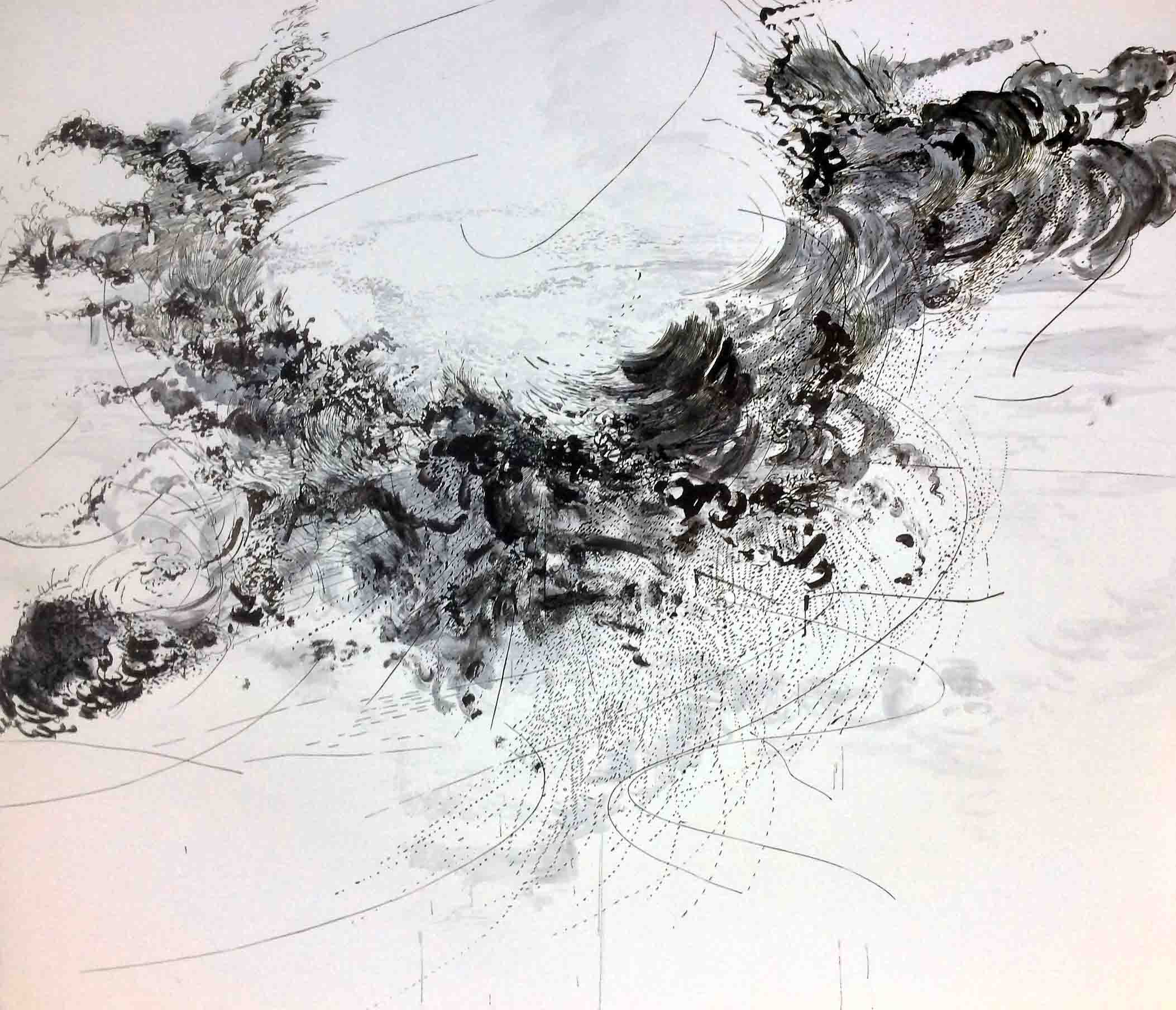
Julie Mehretu creates extremely large-scale acrylic paintings that refer to elements of architecture and mapping. Her work is often epic in proportions, with some pieces being as large as of 21 by 85 feet on canvas. The paintings are visually stunning, full of movement and an energy that seems to erupt and explode outward from a centrifugal force. These paintings are built using multiple layers of drawing with ink, pencil and acrylic paint. She pushes the boundaries between painting and drawing with her highly inventive and unique vocabulary of mark making. Swirling, flowing, erratic, combustible, bursting, choppy, staccato like marks, lines and symbols populate her work.
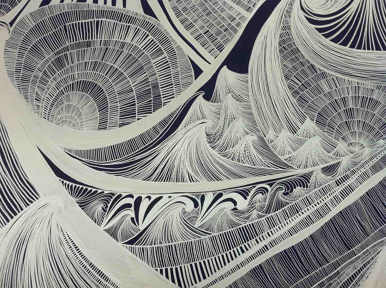
The focus and evolution of her studio practice comes from the language of drawing. In 1995 while in art school, Julie developed a personal visual language -- a system of marks and symbols that she uses in her work to this day. She describes her visual language as an exploration that “goes back to the cellular level where language comes from” Laying down her individual marks in an indexical fashion, she reduced and deciphered the process until her glyph like forms became notational. Different artistic influences in her development are the Russian Constructivists, Kazimir Malevich, the Italian Futurists and Wassily Kandsinsky. J.M.W. Turner’s skies and the atmosphere that he created in his paintings inspire her to paint forces like she senses in his work.
Julie’s rich vocabulary of symbols and glyphs remind me of the marks and lines in the etchings of Rembrandt. Mehretu’s mark making is also influenced by her experience with printmaking and Chinese calligraphy. She is also inspired by graffiti, video games and Japanese manga cartoons.
Julie recognized that one individual mark has a sense of power or social agency She describes: "the hand and mark create a ‘behaviour’ and that groups of similar marks can shift the surface of a picture by its behaviour depending on how they are drawn” for example: aggressive or passive; some groups or communities operate with one another or become devoured by each other. She feels her marks take on characteristics and in turn calls them “characters”. These characters and clusters of marks then needed a place to inhabit where they could behave, retaliate, be self-deterministic or battle with each other.
Looking to outside references, Mehretu typically begins a painting by layering her favoured source materials which usually consists of detailed architectural plans or city maps. Her sources often incorporate schematic depictions of modern, historic or ancient buildings such as stadiums, military and industrial complexes, public spaces, airports, and financial institutions.
Julie creates these “story maps of no location” by projecting some of these references onto her support, using technical pens and rulers to trace them onto the ground. The work is preconceived and intentional. The drawing process references techniques of precision drawing by using a hard-edged geometric style. Mehretu uses Cartesian analysis throughout the research process in order to make sense of the invented places that create a context for her ‘characters’ to invade. At different points, she applies an acrylic and silica mixture which is painted and sanded smooth to create a translucent veil, which allows her to embed the drawn marks beneath creating a spatial depth.
Successive drawings traced become more abstracted through this multiple layering process. This additive and subtractive method is a transformative process that symbolizes change over history and in the painting itself. The top layer contains her painted language, which is applied loose and gestural; her calligraphic marks are painted with brush and ink through an intuitive organic process. Colour is referenced from the code colours on maps and culturally codified colours such as flags.
Mehretu’s paintings ‘depict social concerns of power, history and globalism layered with her own narrative of place, space and time that impact the formation of personal and communal identity’.
Paintings of the last few years include what she calls a ‘third space,’which emerges from the collision of the architectural drawings, her mark making and through repeated erasure. She metaphorically describes this third space “as the ruin or the un-building of space - a hybrid identity, an area of the sublime”. Mehretu describes all of these moments as being mashed together where a new potential emerges.
Julie’s central focus is always on the drawing process. She tries to understand her work through drawing; it is her point of entry and departure. Drawing is the backbone language of her practice, it informs and supports everything else in her work. Written by Jill Ehlert
For more information on Julie:
PBS Video: Art21 - This is a great video as are all the artist videos at this website
Audio interview from British Museum with Tim Marlowe and Julie Mehretu in conjunction with the show "Picasso to Julie Mehretu" modern drawings from the British Museum collection.
Magazine Interview with Julie Mehretu and Lawrence Chua at Bombsite.com
Art in America/November 2010 - article by Eleanor Heartney "Invisible Networks"
Check out Julie's work on Google Images
Drawing Now: Eight Propositions
Drawing book on my shelf:
Drawing Now: Eight Propositions
Published/ 2002 by The Museum of Modern Art - Laura Hoptman
Drawing Now, published to accompany the first major survey of contemporary drawings at The Museum of Modern Art, New York, in 15 years, contains more than 100 color reproductions of work by 26 international artists, both well-known and emerging, that demonstrate the fascinating variety of methods and approaches, mediums and scales, apparent in this old-again, new-again art. Accompanying essays by the exhibition's curator, Laura Hoptman, explore eight themes that she perceives in the field--Drafting & Architecture, Mental Maps & Metaphysics, Popular Culture & National Culture, Fashion, Likeness & Allegory, Envisioning a City, Science & Art, Comics & Other Subcultures, Ornament & Crime--and provide key impulses behind drawing's recent resurgence.
Artists Include: Kara Walker, John Currin, Toba Khedoori, Chris Ofili, Franz Ackerman, Kai Althoff, Russell Crotty, Graham Little, Mark Manders, Barry McGee, Julie Mehretu, Yoshitomo Nara, Paul Noble, Jockum Nordstrom, Jennifer Pastor, Los Carpinteros,Laura Owens, E;izabeth Peyton, Matthew Ritchie, Ugo Rondinone, Shahiza Sikander, David Thorpe, and Richard Wright amongst others.
Essay by Laura Hoptman.
Paperback, 9.5 x 12 in., 192 pages, 130 color
Contemporary Drawing Today
The past twenty years have seen an emergence of drawing as a dynamic art form.
Since the 1990s, many artists challenged and rejected “process art” of the Conceptual and Minimalist artists from the 1960's -1970's as well as the post-1980's conceptualists.
Artists of that earlier time period felt drawing was the “act of doing”, a direct method for documenting ideas, emotions or discoveries made during the creative process. The "action taken" was the work of art; the end product was not the principle focus.
Contemporary drawing artists today have connections to the working practice of nineteenth-century artists with representational references and fully realized art works. The artists of this new millennium differ from those in the mid twentieth century given they draw with intention, make choices and consider formal and abstract issues in their work.
With a resurgence in this discipline and a new found freedom, drawing artists of the twenty-first century, redefine and push boundaries in new directions. Their art sometimes flows off the page and into the real world; the visual language of the two-dimensional invades the three-dimensional merging with time and space.
Disciplines such as sculpture, video, film and performance are incorporated into this new expanded field. Drawing artists look to outside references such as cartographic language, cartooning, video games, Chinese scroll painting and calligraphy. They employ the techniques and formal vocabularies of precision drawing, scientific and architectural drafting, industrial and commercial architecture, ornamental design and the everyday object as a way to project their ideas. They draw upon notions of intimacy, subjectivity, history, globalization, memory, nostalgia and the narrative.They experiment and push the limits of non-traditional materials like rope, string, ribbon, mylar, film, magnetic tape, cable, wire, sticks, maps, boards, pins, nails, cardboard...the list is endless. Exploring methods by burning, soldering, cutting, projecting, tyeing, knotting, etc.
Drawing today has become a primary mode of expression.
Over the next week I will introduce you to artist's who employ drawing as the main focus in their art practice; as well as books on drawing artists and techniques.
JULIE MEHRETU
Julie Mehretu is an American artist who was born in 1970 in Addis Ababa, Ethiopia. In 1977, the family fled their homeland immigrating to the United States and settling in Michigan. Mehreutulives and works in New York City, NY and Berlin, Germany.
Mehretu creates large-scale abstract paintings with a narrative content, one that reflects her interest in geography, architecture, history, and urban life. Mehretu’s favourite source materials consist of architectural plans and city maps. These often incorporate schematic depictions of modern, historic or ancient buildings such as stadiums, military and industrial complexes, public spaces, airports, and financial institutions. Julie Mehretu illustrates her social concerns of power, history and globalism layered with hernarrative of place, space and time that impacts the formation of a personal and communal identity.
Mehretu’s paintings are visually stunning, full of movement and an energy that seems to erupt and explode outward from a centrifugal force. These paintings are built using multiple layers of drawing with ink, pencil and acrylic paint. She pushes the boundaries between painting and drawing with her highly inventive and unique vocabulary of mark making. Swirling, flowing, erratic lines and symbols populate her work.
Drawing From Life
Another book from my shelf
Dawing from LIfe: The Journal as Art Jennifer New
Keeping a journal has become a popular means of creativity and self-expression.
Here the works of 35 contemporary and historical journal keepers are explored through visual elements such as drawings, photos, collage, charts and detritus taped into journal pages. The images are accompanied by profiles that highlight journal-keeping habits and the creative process driving the writer.
The examples used here have been provided by contributors from all professions and walks of life, including David Byrne, Mike Figgis, Carol Beckwith and Sophie Binder. Their examples will provide journalers with a host of new ideas to enhance their own journals.
Book review and a look inside the book, click on: Parka Blogs
Books on Sketchbooks
I love drawing and working in sketchbooks, this is a passion of mine. Over the years I have created many sketchbooks and continue to do so. I also love looking at books about sketchbooks.Today I introduce you to this one:
by author Richard Brereton
To read a great review and to see several pages from inside the book visit this page on my favourite blog: Brain Pickings
Comparing Ivory, Carbon and Mars Black
I wanted to share my research and experimentation with you. So many times in workshops students have asked me the differences between the various blacks that are available. [Black Gesso is another option]. The best way to "see" it for yourself is to play around with all your blacks on a test sheet so you can compare the differences.
I thought this chart might be helpful for you.