Metchosin International Summer School of the Arts
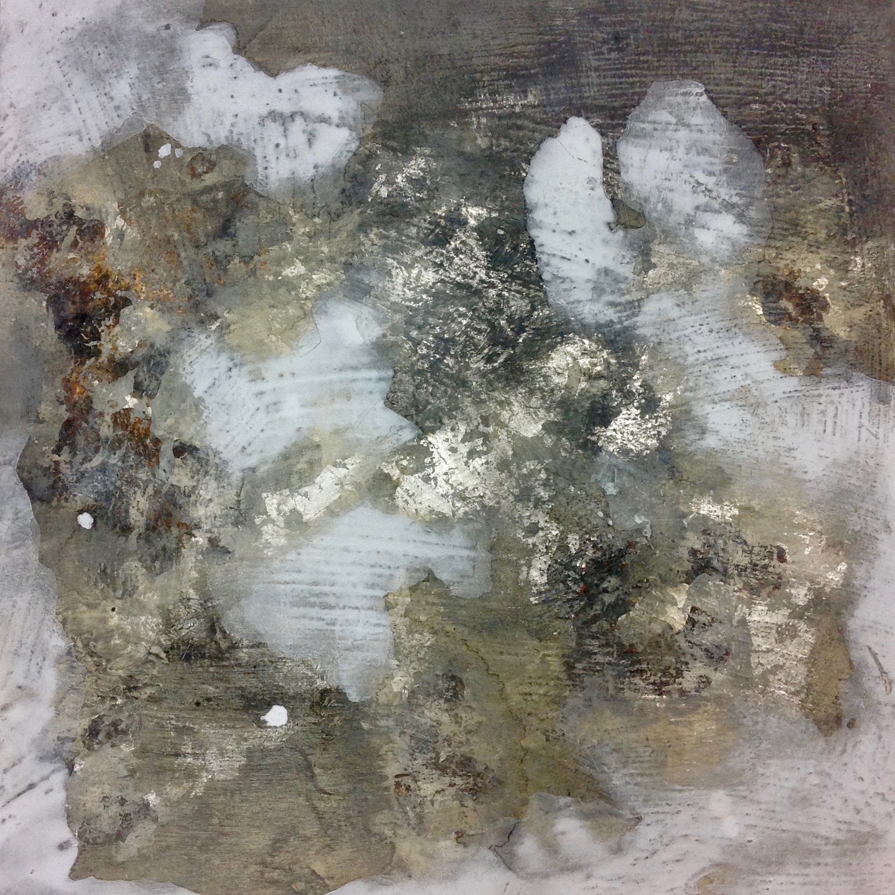
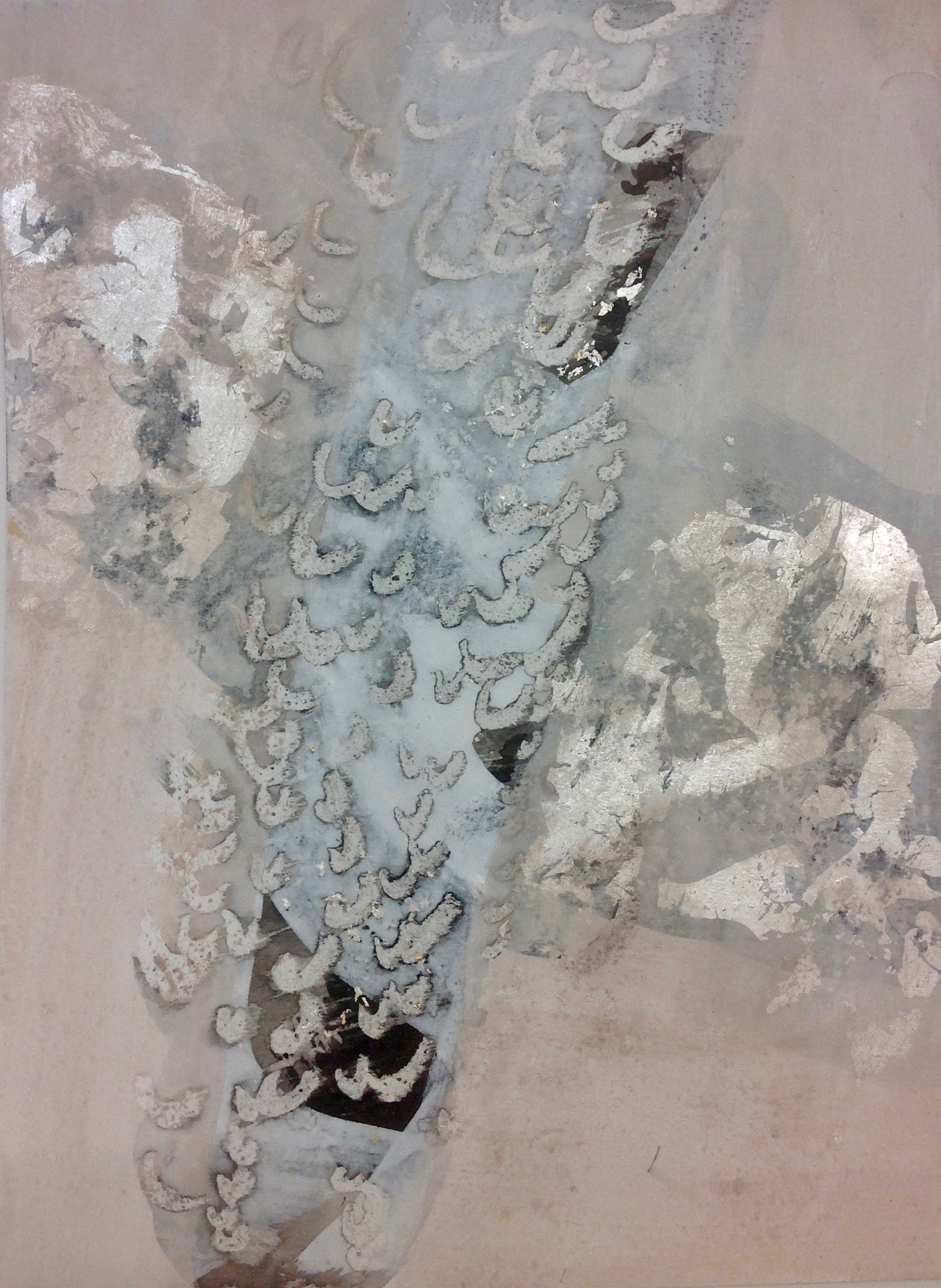
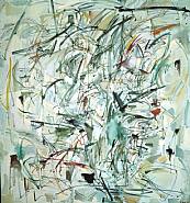
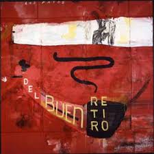
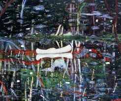
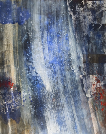
JILL EHLERT - 12" X 12" - Mineral pigments, oyster shell white, oxidized Japanese silver leaf , pumice ground on cradle board.
I attended a 5-day workshop July 3-7, 2017 with instructor Judith Kruger at the Metchosin International Summer School of the Arts (MISSA). I had a fabulous experience. The workshop was exciting, challenging, filled with new materials, tools and techniques. Judith has boundless energy, a knowledgeable teacher who is dedicated to Nihonga - "traditional Japanese mineral pigment painting". Judith amalgamates this ancient form of painting with her contemporary art practice, "exploring the formal and conceptual junctures between historic process and modernity as an ongoing project".
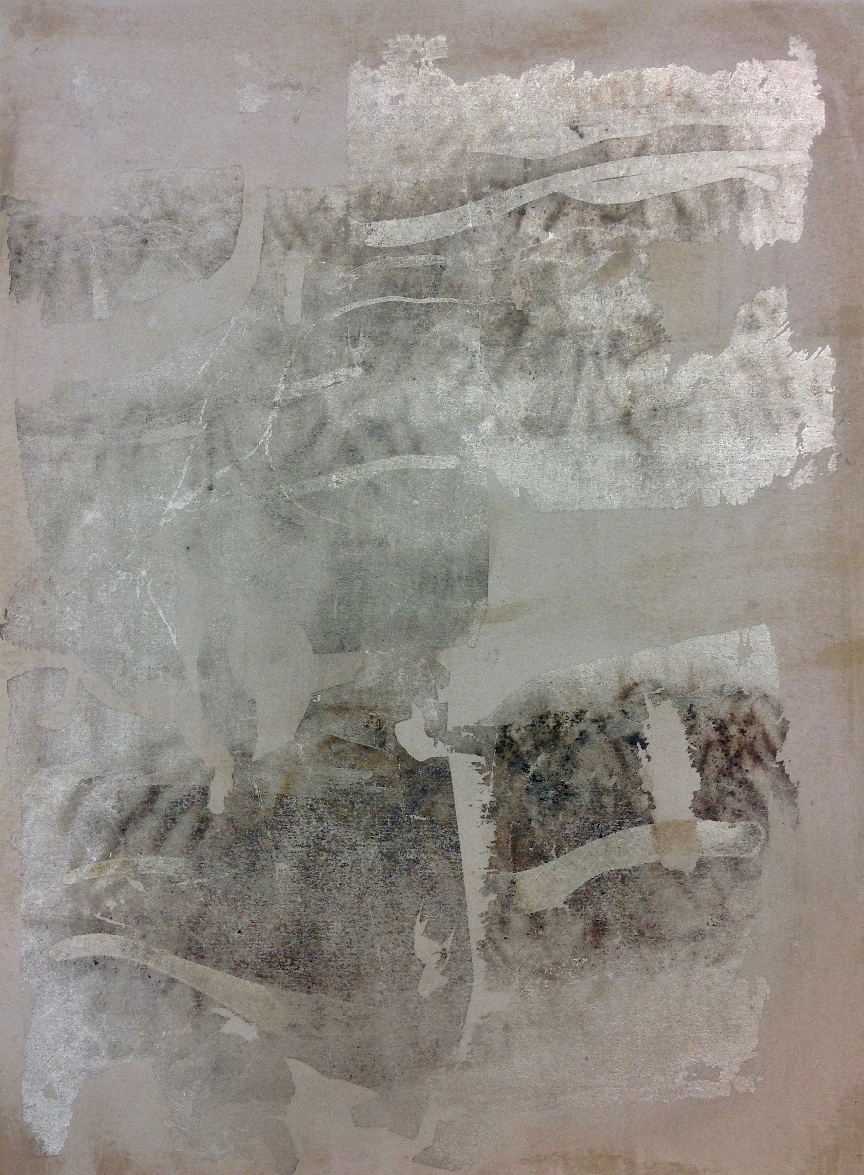
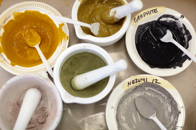
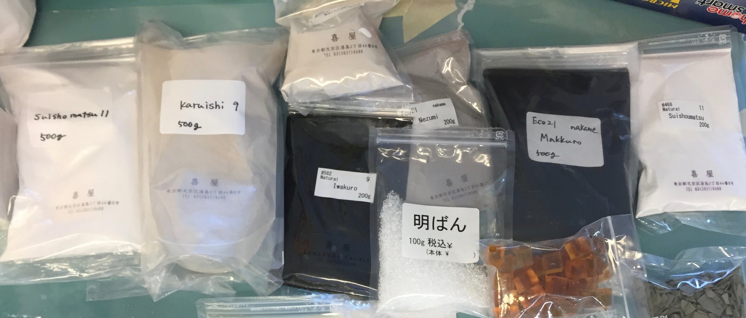
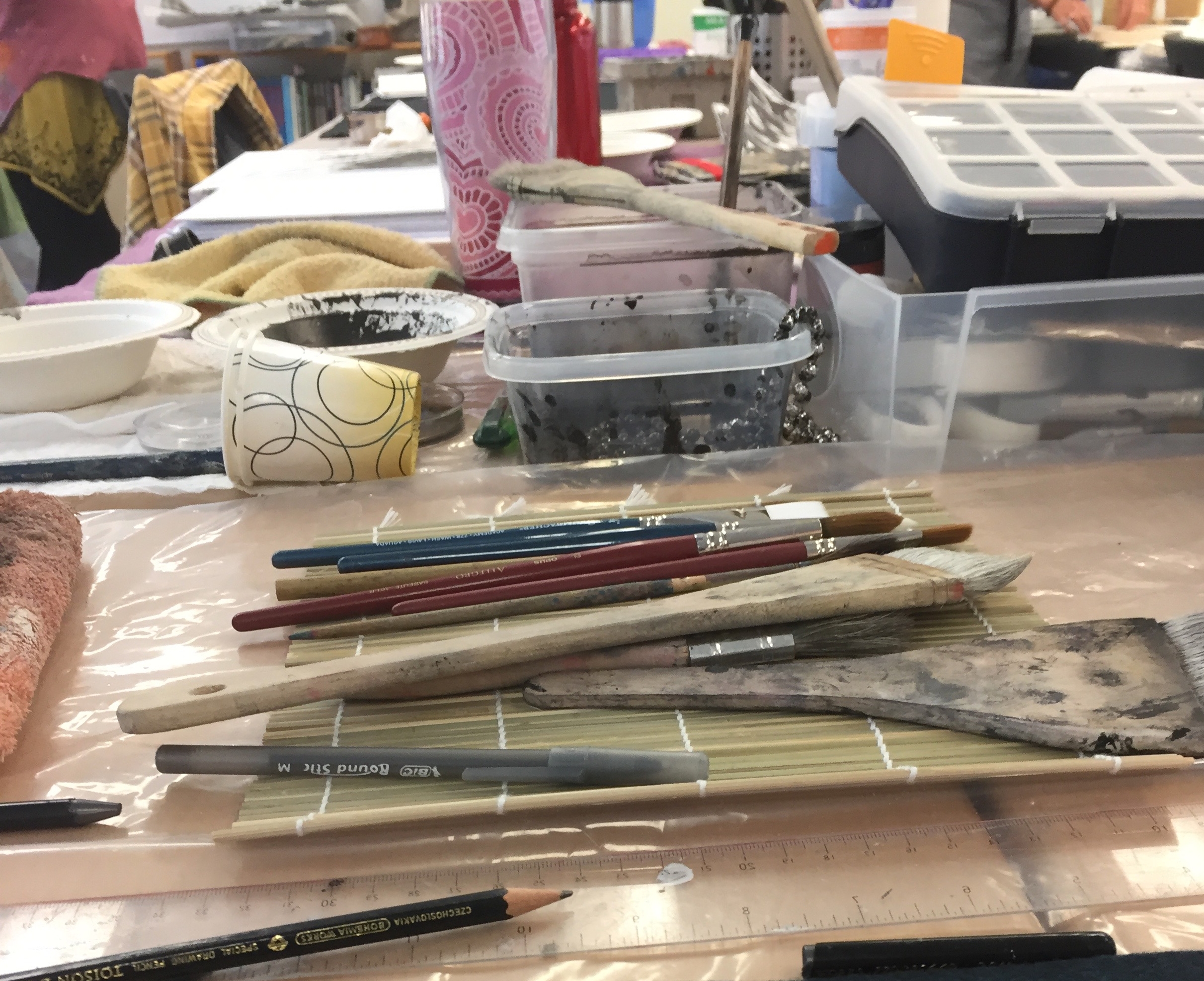
Everything in this workshop was new to me. We made our own paint and ink from organic and inorganic matter like cured oyster shells, minerals, natural ores, pine soot, mica and silica. We made a natural glue from cow cartilage to act as the binder. The materials are ecological, non-toxic and water-based. We worked with Japanese silver leaf and learned methods to oxidize it. Judith demonstrated how to mount Washi and stretch watercolour paper onto a cradle board. It was an action-packed week.
THE LOCATION
The Metchosin International Summer School of the Arts has been providing high caliber specialized workshops for artists, teachers and serious adult students since 1984. MISSA has a reputation for hosting local, national and international instructors who engage with students in an intense multidisciplinary environment. MISSA welcomes students from around the world to participate in an artistic emersion for two weeks every summer.
Artists from near and far have come together each summer to the Pearson College campus to share in spirited creative exchange. The school is positioned on the sheltered shores of Pedder Bay and looks out to the Straits of Juan de Fuca and the Olympic Mountains beyond. The campus setting provides a stimulating natural environment for artistic development and exploration. It’s easy to understand why so many return year after year to be part of the ‘MISSA Magic’!
MISSA takes place every summer on the campus of Pearson College, while the students are away. Participants at MISSA can stay in college style dorms where internationals students have spent their school year. The college campus is designed in a West Coast Modern style and takes the from of a seaside village with buildings of native cedar clustered on 75 acres of old growth rainforest. The simple, low-slung structures are linked by footpaths and stand in harmony with the surrounding landscape.
THE WORKSHOP SPACE - THE FLOATING STUDIO
I was fortunate to attend a 5-day workshop July 3-7 which was held in the "Floating Studio", also known as the marine lab during the regular school year at Pearson College. The Pearson campus is in a fabulous location on Pedder Bay - truly a magical place. I stayed in residence for the duration of the week. Resident students arrive the day before, on Sunday night and also stay the night of the final day of class, for a total of six nights and leaving on the seventh day. The food is fabulous and all one has to do is art all day with all meals and snacks provided. Students can go back to the studio in the evenings.
Photos by Jill Ehlert unless otherwise stated.
The Floating Studio - aka the Marine Lab.
The Floating Studio
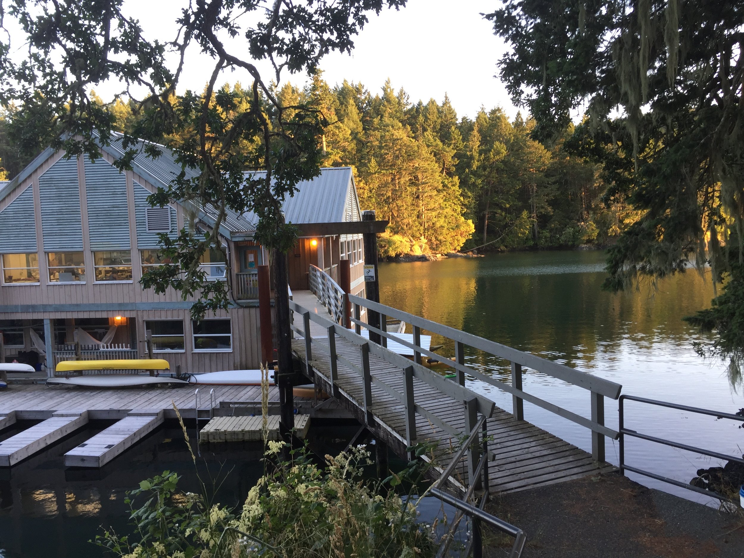
The Floating Studio in the evening.
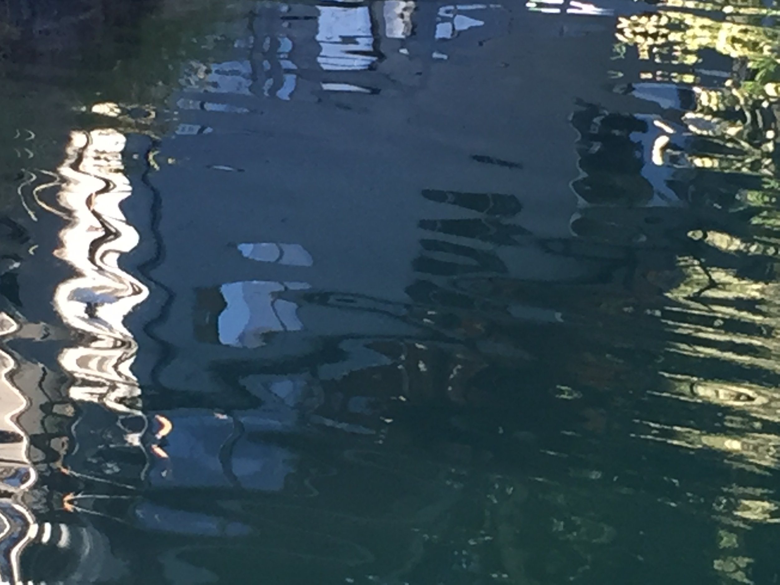
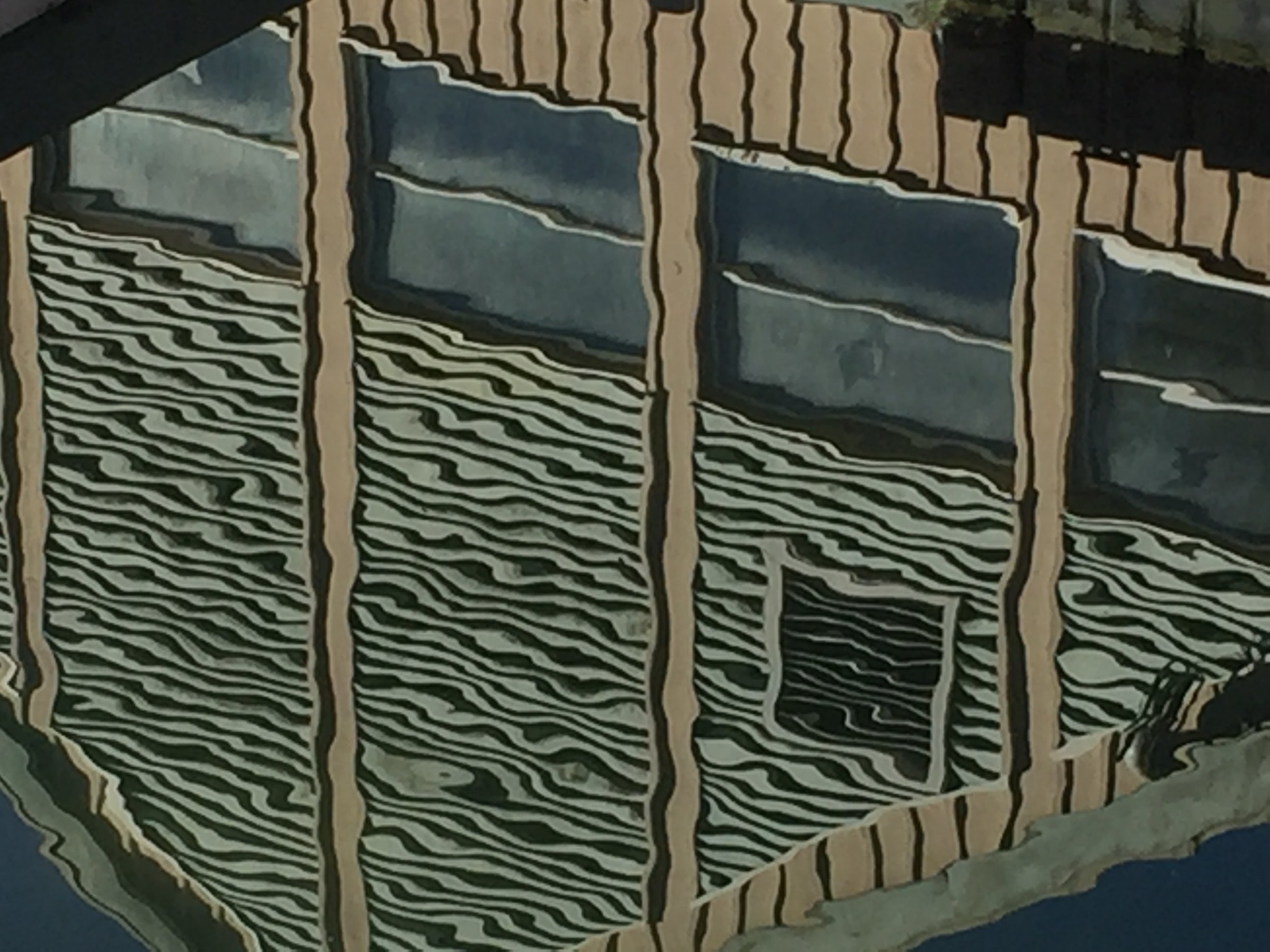
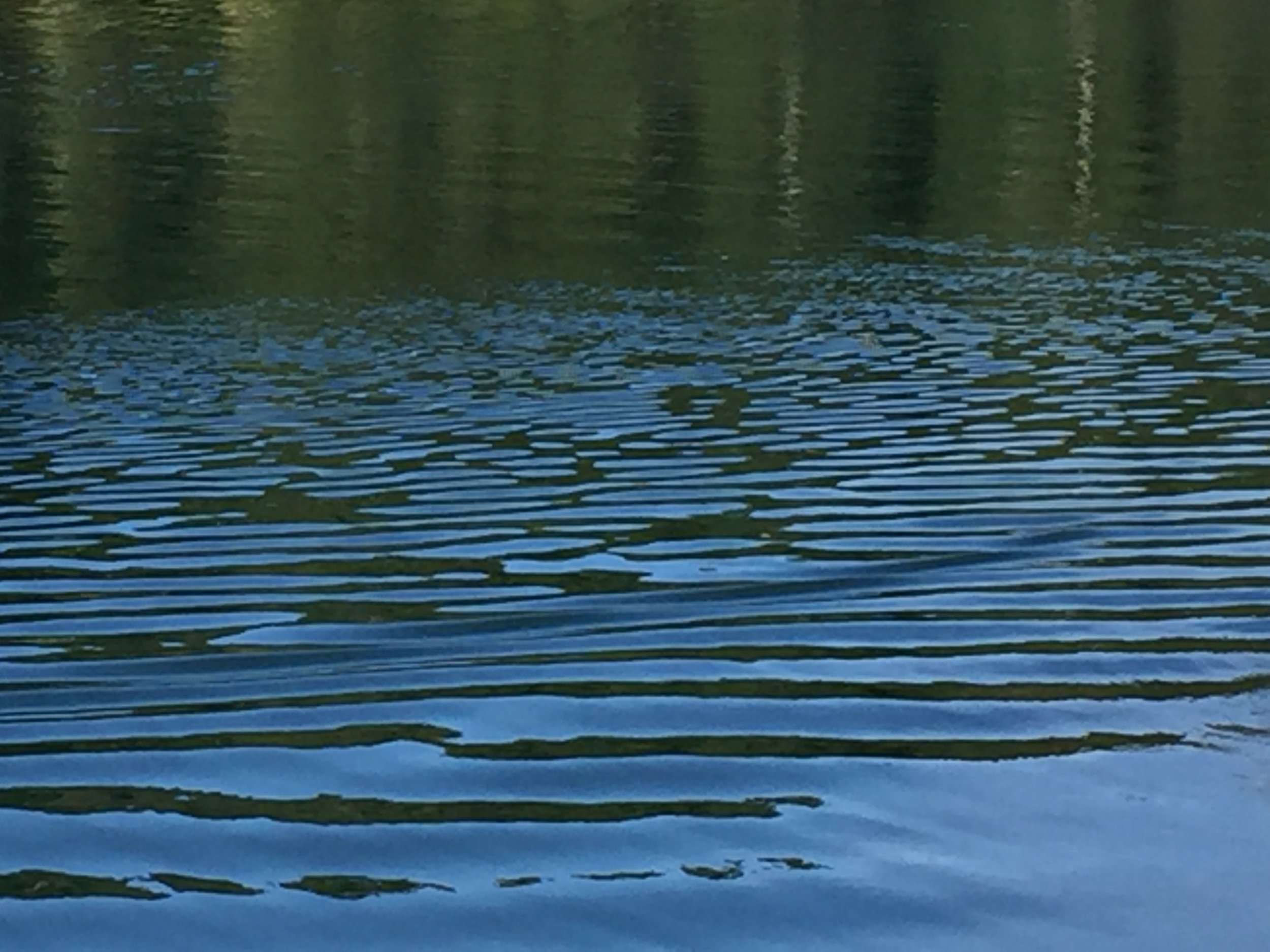
REFLECTIONS AROUND THE FLOATING STUDIO


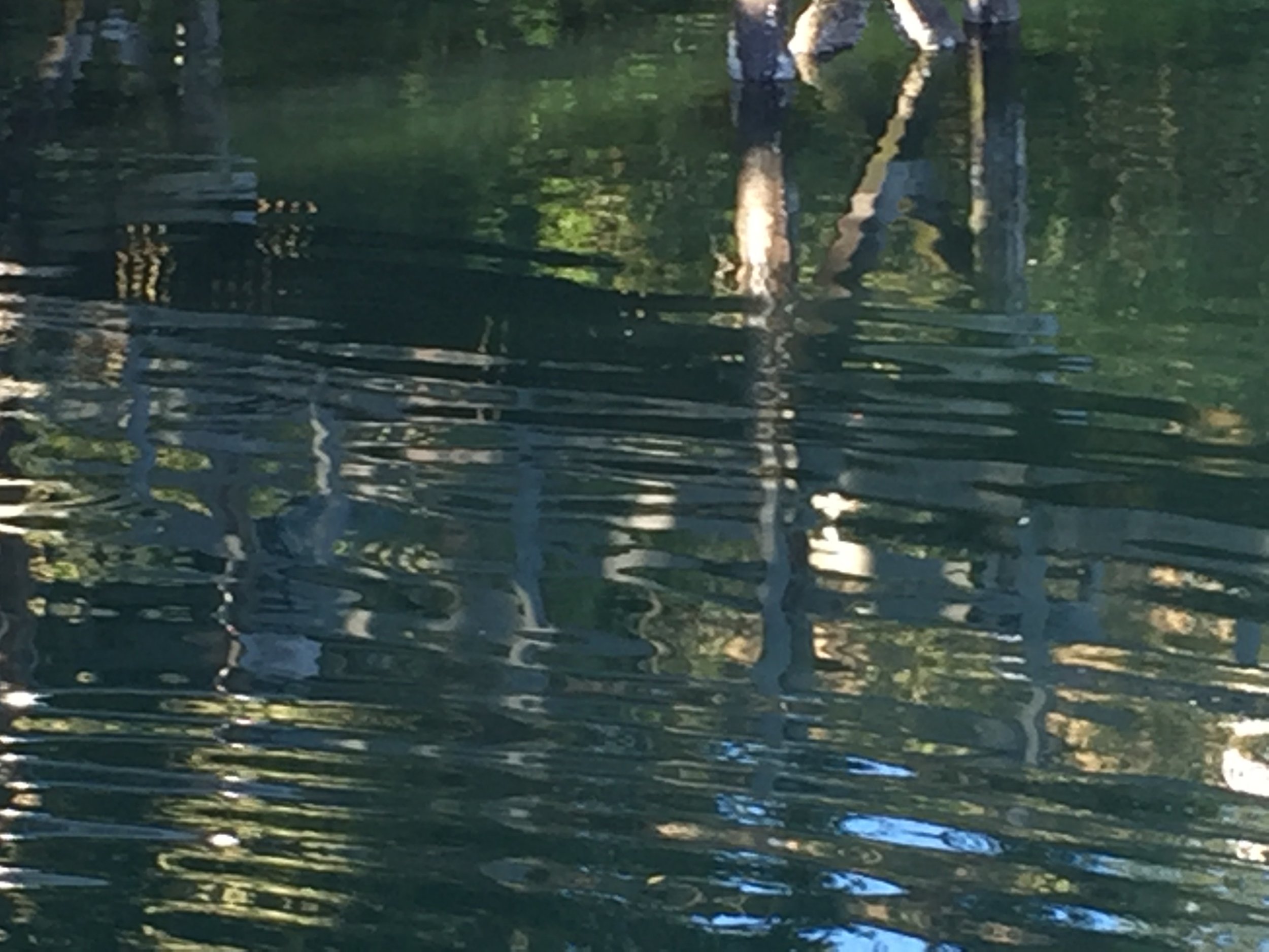

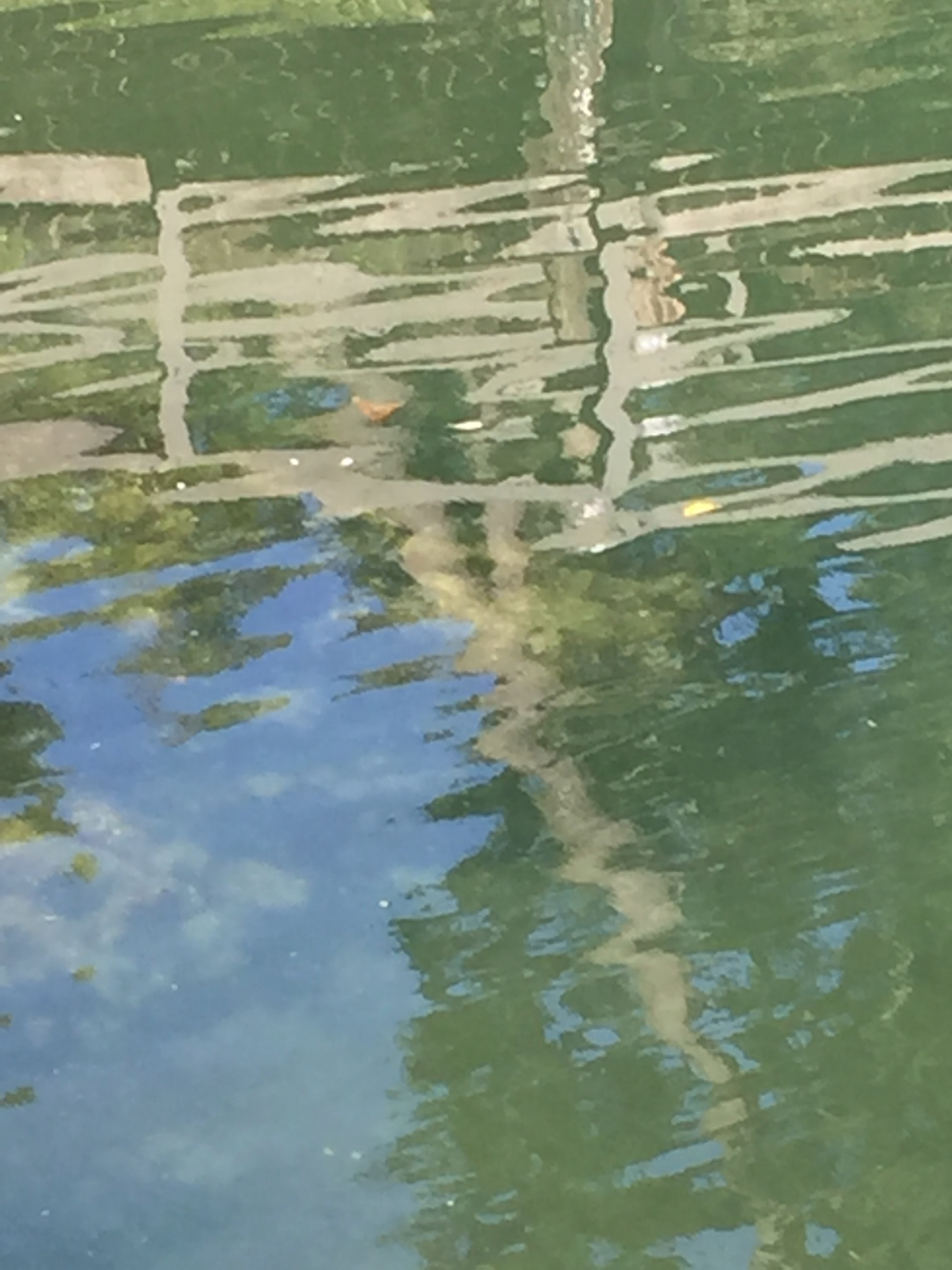

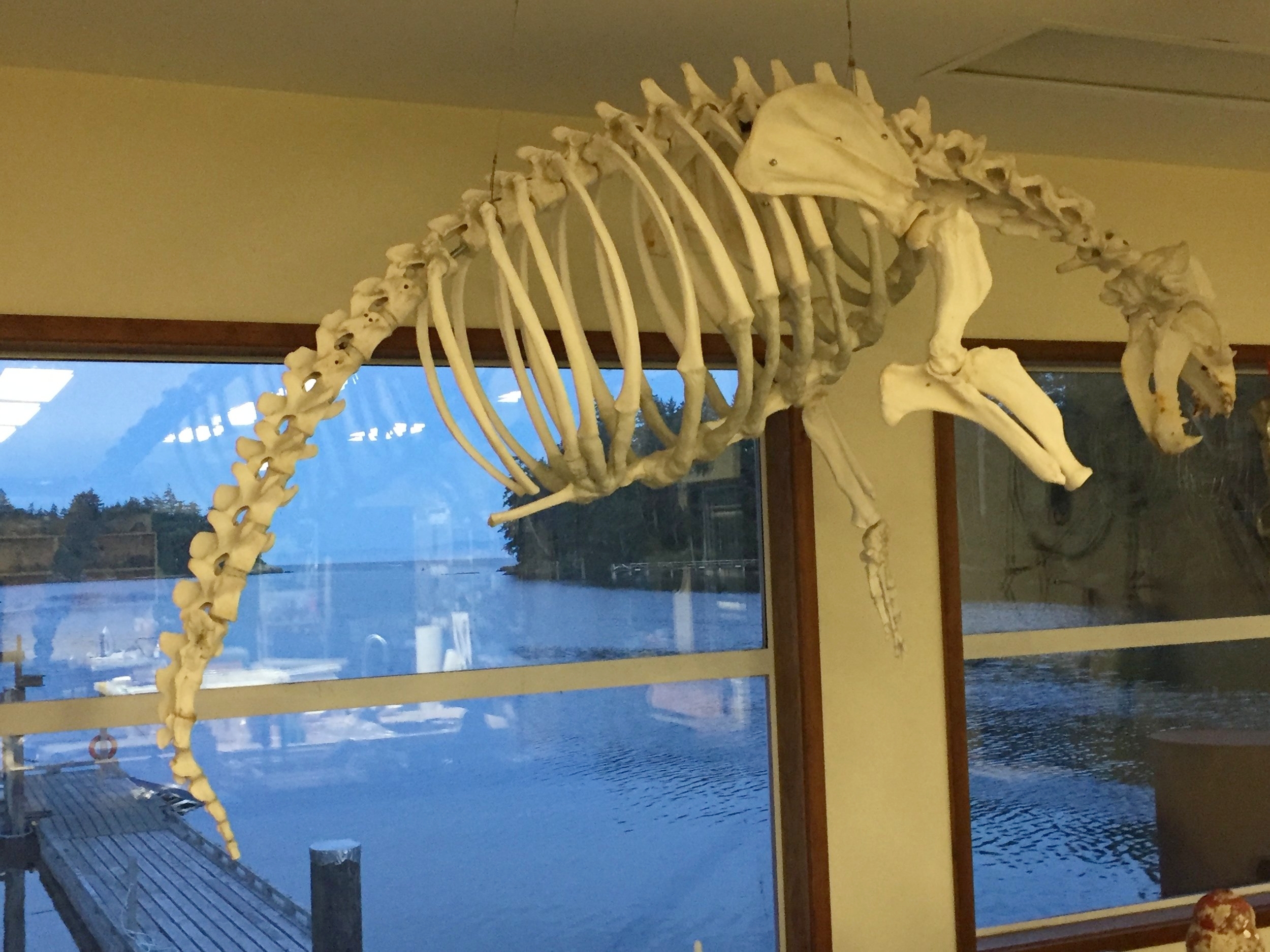
THE FLOATING STUDIO/THE MARINE LAB - A view from our workshop space and one of the critters we shared the space with.
THE WORKSHOP - "ABSTRACT ALCHEMY: BLACK, WHITE AND WARM METALLICS"
A Description of the workshop from the MISSA catalogue "In this course, students will reinterpret nature’s deep imagery and essence with a limited palette using matter from nature itself. Participants will make paint, ink and home-made gesso from inorganic and organic sources including pine soot, shells, and minerals. Natural metallics will be introduced for warmth. These arcane processes have been employed for thousands of years on ancient Asian screens and scrolls. Collage can be added and embedded for depth. A variety of drawing and painting techniques will be introduced to yield meaningful, process-driven, ecological work on varied supports, embedded with individualized expression, heart and spirit."
THE INSTRUCTOR - JUDITH KRUGER
Judith Kruger, is an American visual artist whose paintings, prints and mixed media works address Human-Environment connectivity and their shared vulnerabilities. She is recognized internationally for her advocacy of natural painting materials and historic, ecological processes.
Judith currently resides in Northwest, CT. Her studio is located in an old hosiery mill, 125 miles north of New York City, at the foothills of the Berkshire Mountains. Click here to read Judith's artist statement.


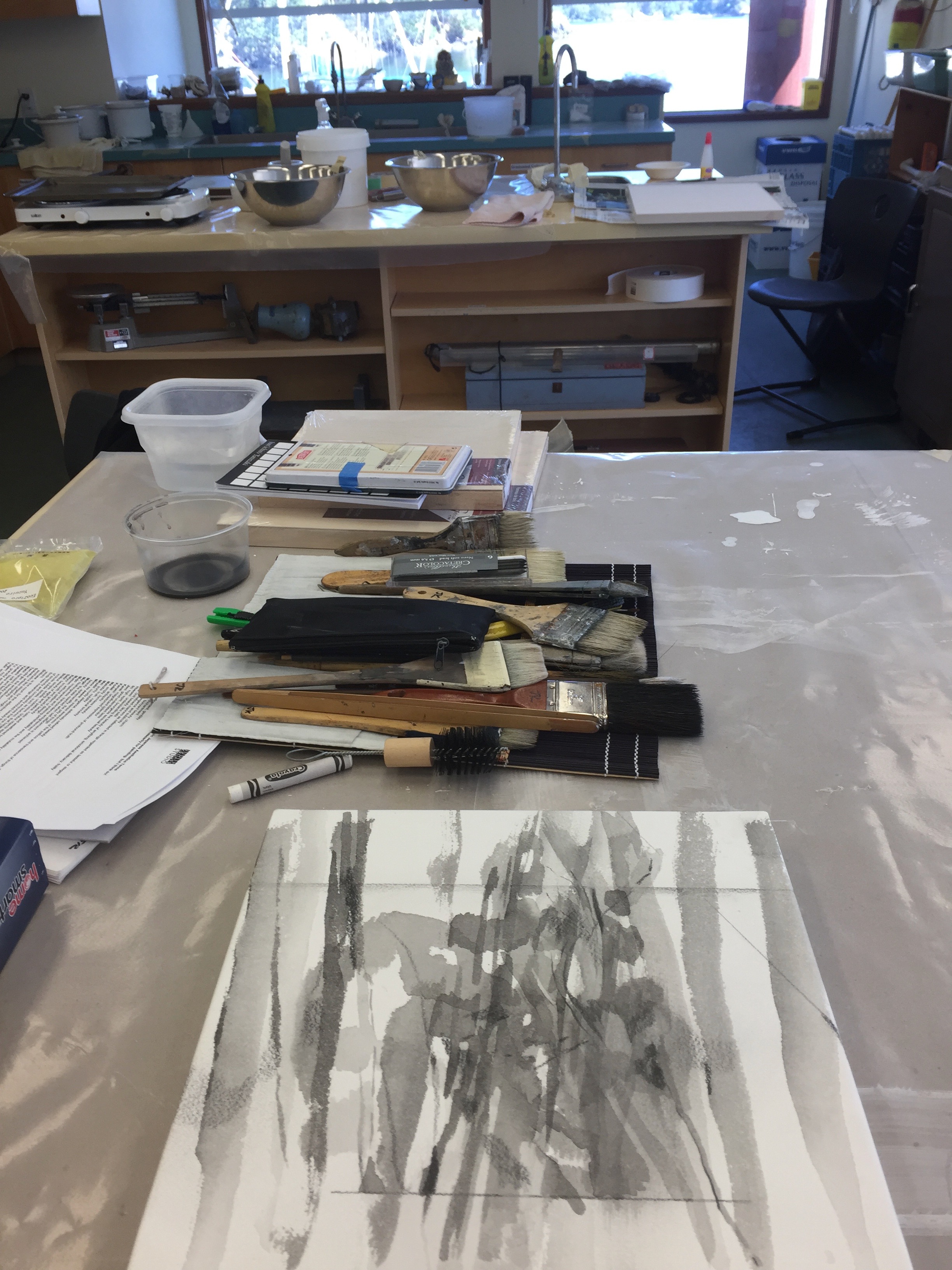
SOME OF THE TOOLS AND MATERIALS IN THE WORKSHOP


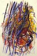
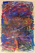
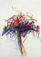
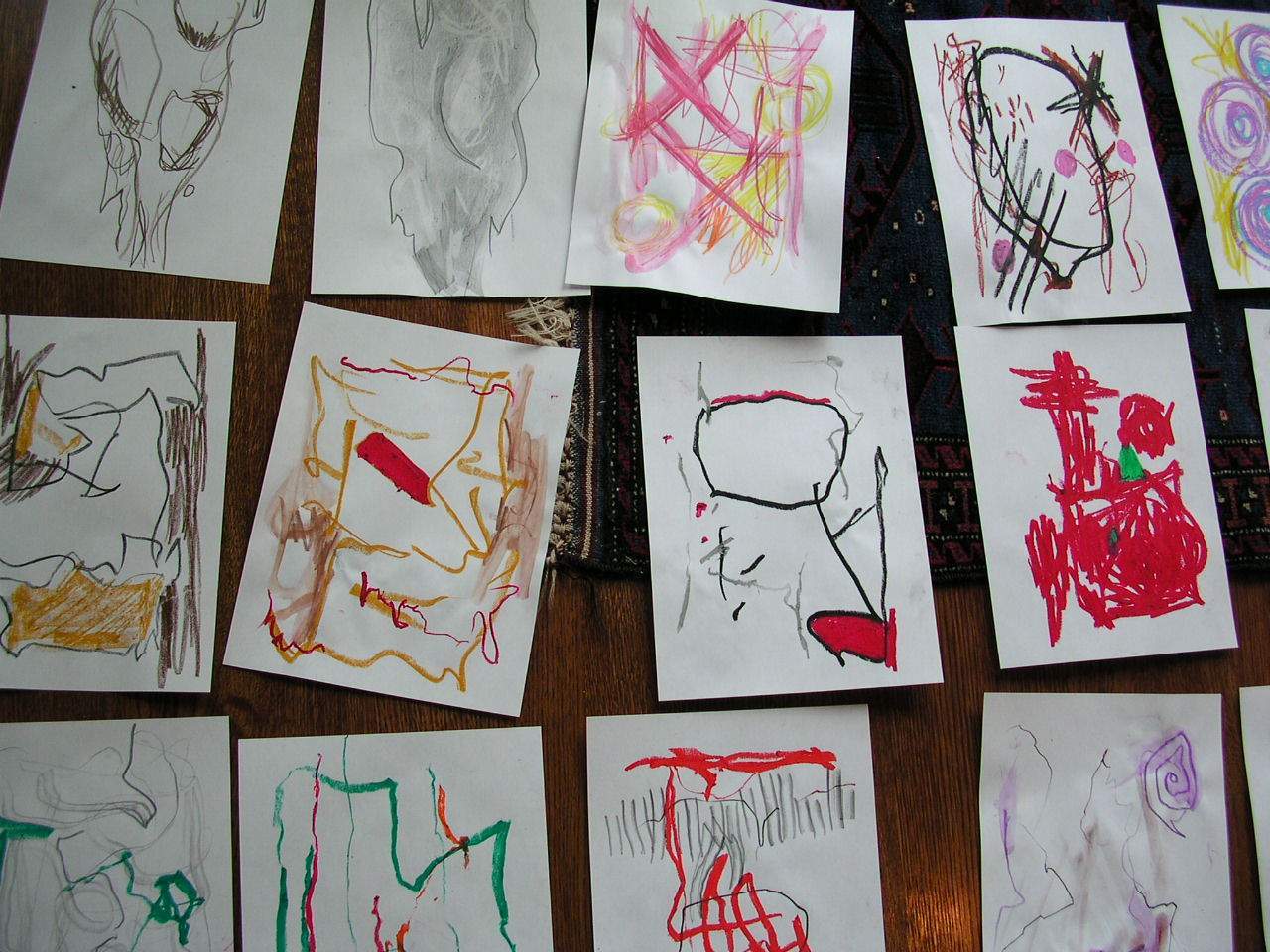
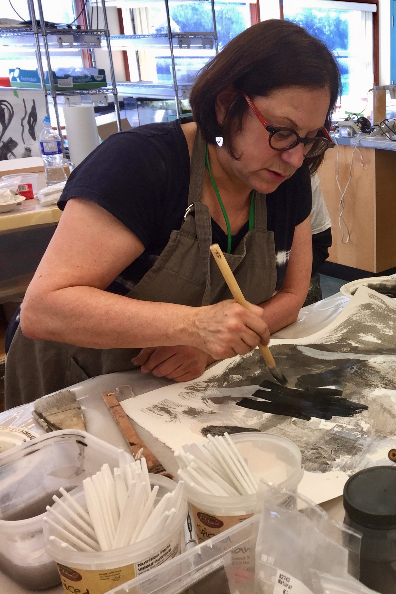
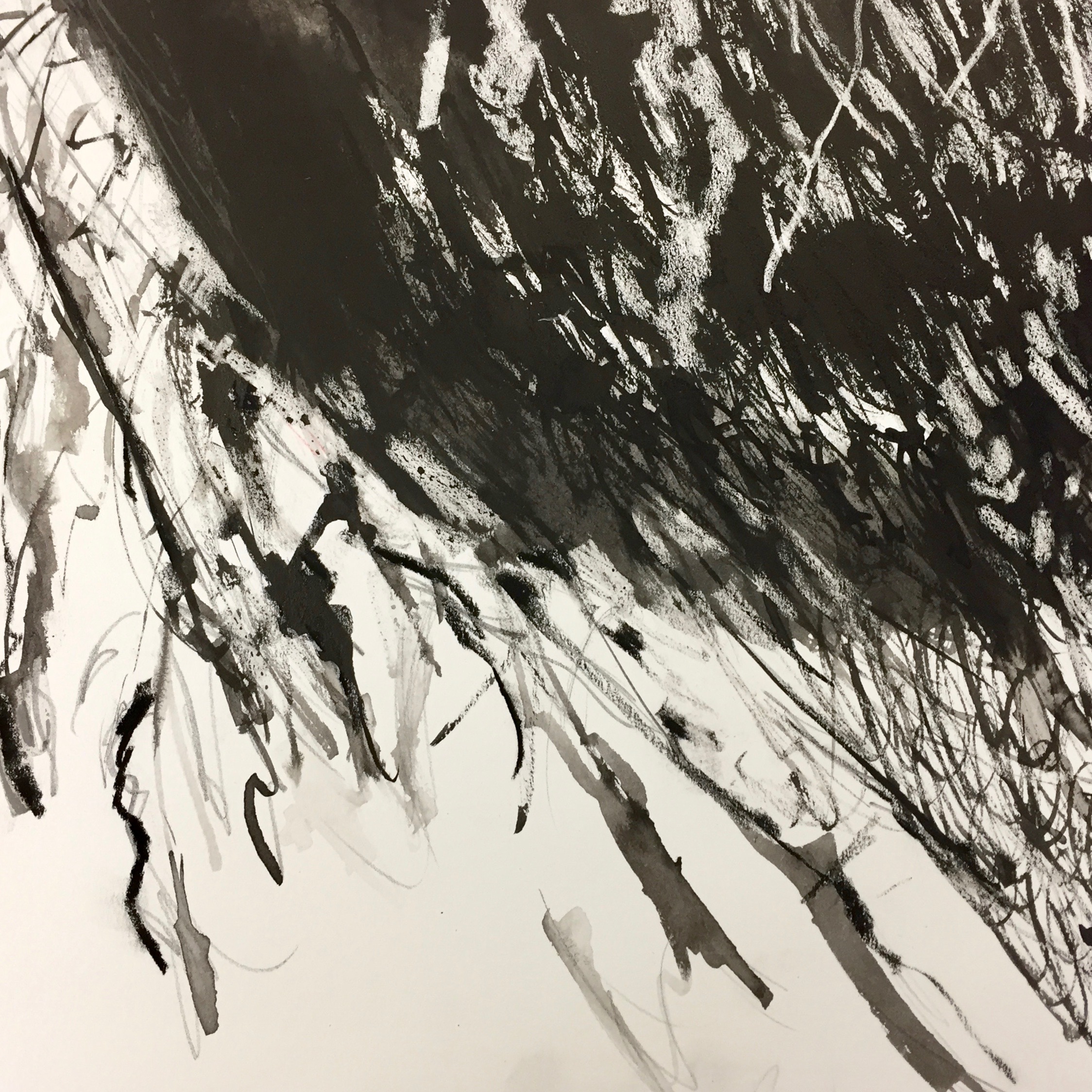
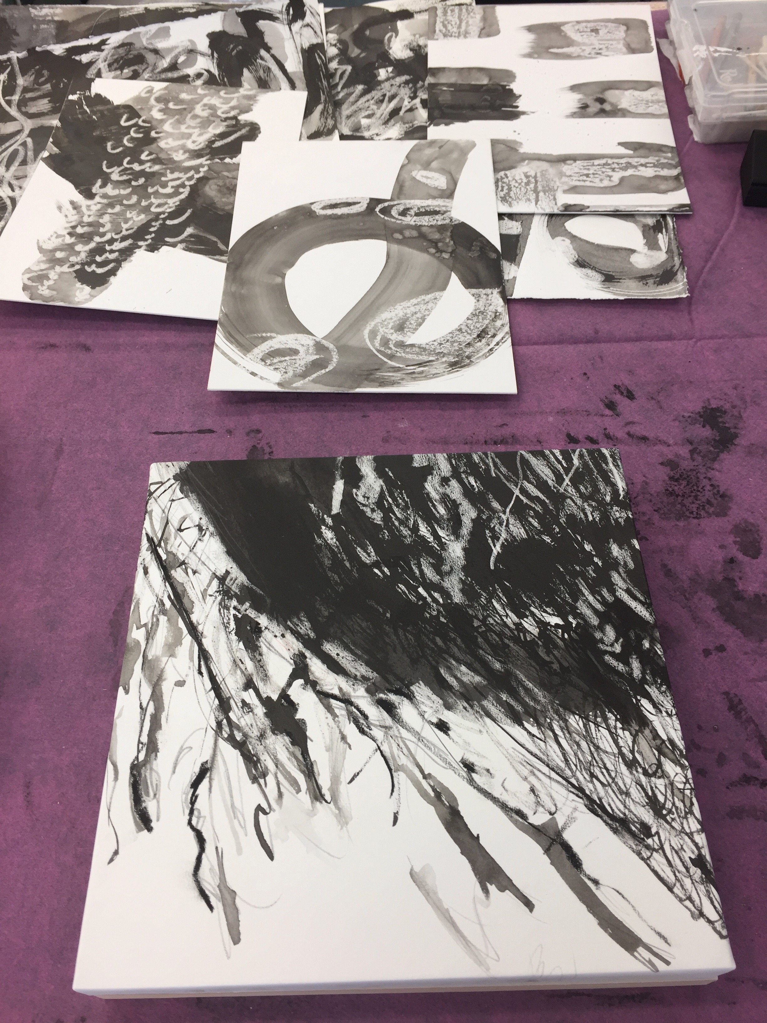
DRAWING/PAINTING WITH SUMI-E INK


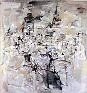
The Sumi-E ink drawings above were incorporated into the mineral pigment painting below.
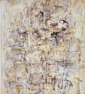
Jill Ehlert ©- 24" x 18" - Sumi-E Ink, Mineral pigments, Japanese silver leaf, antique Japanese pharmacy paper, punched holes on Washi paper mounted on cradle board.
Shadows as inspiration. Photos and work (12" x 12") by Jill Ehlert


My WORK IN PROGRESS AT MISSA
Working on a Sumi-E mat - made of wool and polyester felt.